Problem Statement
myMomentum wanted our help to redesign their already existing app. Their goal was to minimise the user fallout due to the app’s inconsistent user flow as well as maintain User Retention greater than 5 days. The new flow would improve user experience, increase user engagement and create stickiness by introducing gamification to the app.


Project Goals
Expand a loyal customer base
Differentiate from competitors through innovation
Increase engagement through gamification
Improve the in-app experience
Research Methods
We contacted some of the users of the app to learn what they really thought about it. We were interested in what they liked or disliked using myMomentum app and the challenges they face using it. Due to the circumstances dictated by the Covid 19 we were unable to perform face to face interviews, so we schedules Zoom calls instead.
Interview Key Findings
What users said…
“I try to be mindful of my physical and mental health but I don’t know how.”
“It would be nice if there were ways to gain bonus points based on the days in a row you’ve completed challenges.”
“It would be nice if it could show you are attending or inviting others in.”
Core User Needs
Feel committed to complete my wellness challenges
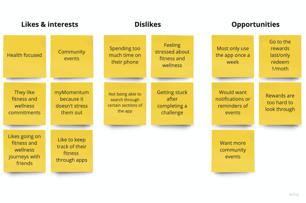
The diagram showed that the majority of our demographic was female. They were health focused and enjoyed having fitness and wellness commitments.
Easily find myMomentum community events
They liked myMomentum because it did not stress them and loved community events and would like for myMomentum app to have more of them.
Keep the challenges small and doable
The users don’t necessarily like to be on their phone all the time which explains why they liked myMomentum app’s bite-sized challenges.
Search for my Preferred rewards
Although “Rewards” is usually the least the users care about, yet they would like to be able to search for a desirable one if any.


Following our customer interviews, we gathered our findings and were able to create a customer journey and persona and an affinity diagram which were presented and discussed with the client.
These exercises formed a great foundation to move into feature ideation and prioritisation.
The landing page (Home) shows the 3 main features and the user can click on each to see the related page. The tree on the bottom of the page grows with the user competing each challenge.

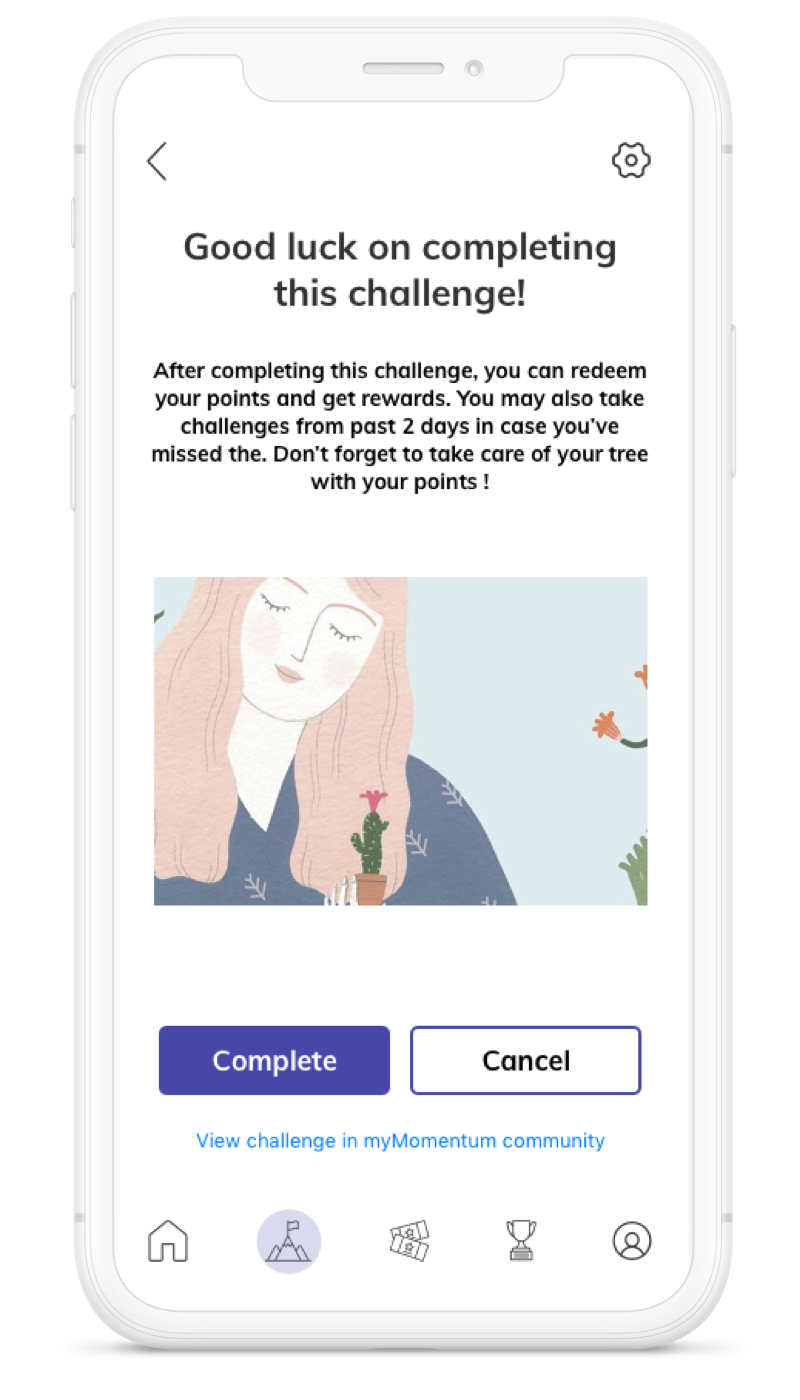
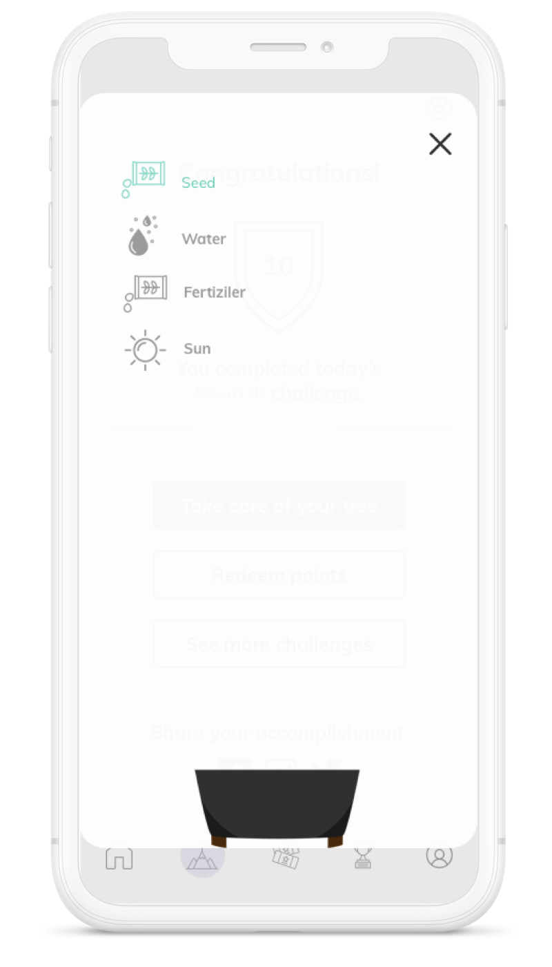
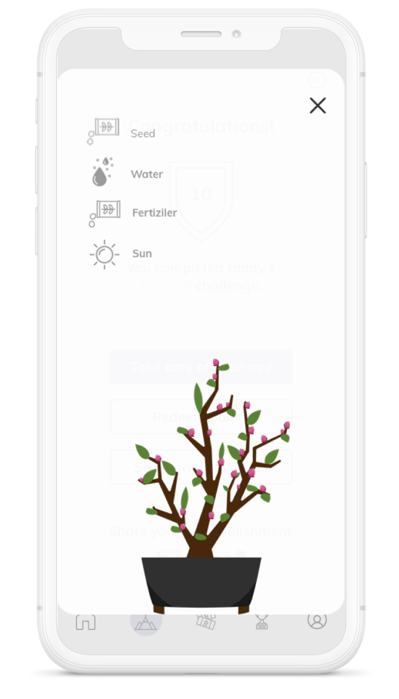
After the user clicks on “take challenge”, the app gives her the opportunity to actually complete the challenge before they can come back to clicks on complete. This will increase user engagement. Every time the user completes a challenge they are directed to a page where they can take care of their tree. This adds to the gamification, brings the user back and increases retention.


The user can follow the challenges they have completed and the rewards and badges that they have achieved.
Conclusion
To summarise, in the short amount of time that we had, we did our best to redesign the app in a way that the new flow would bring back the users more often. The gamification would certainly add excitement and the rewards are now more accessible and easier for users to search through. They are now able to share the events with their friends and family which would accumulate more users. And finally the dashboard or the user profile would give the user a better sense of belonging to the app and makes them want to return and improve their personal dashboard.

